How to Mix Brass and Wood Without Matching Everything
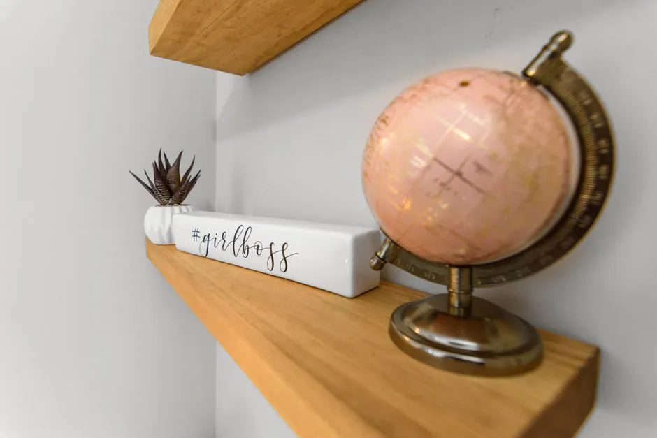
- Repeat the relationship, not the exact finish
- Identify the dominant wood family
- Read brass as a family, not one colour
- Use a dominant, support, and accent structure
- Place the first brass near the dominant wood
- Mix wood tones through contrast and grain
- Choose a bridge material
- Control sheen before adding colour
- Let lighting reveal, not flood, the finishes
- Build one shelf without making a showroom
- Update hardware without creating new holes blindly
- Clean each material according to its finish
- Edit before shopping
- Use a final coherence check
Repeat the relationship, not the exact finish
Mix brass and wood by choosing one dominant wood family, one supporting wood, and a brass finish repeated in two or more visible places. Compare samples in the room’s real light, vary the scale of objects, and add a quieter bridge material such as linen, stone, warm white, charcoal, or glass. The goal is recognition without cloning: materials should look acquainted, not issued matching passports.
Start with what is fixed. Flooring, cabinetry, a dining table, or a large built-in matters more than a new candleholder. Name its undertone and visual weight before adding another wood or metal.
Identify the dominant wood family
Wood changes with species, cut, stain, finish, age, and light. Instead of relying on a seller’s colour name, describe what you actually see:
- Honey or golden: yellow, amber, or caramel movement.
- Red-leaning: cherry, cinnamon, or auburn notes.
- Neutral brown: balanced brown without a strong red or yellow pull.
- Smoked or deep: espresso, charcoal-brown, or near-black areas.
- Pale: cream, sand, or light beige movement.
These are observation labels, not botanical identifications. A stain named “walnut” does not prove the substrate is walnut, and two walnut-labelled finishes may disagree completely.
Pick the largest wood as dominant. A smaller supporting wood can either relate by undertone or contrast clearly in value. The awkward result is usually not contrast; it is a near-match that looks accidental.
Read brass as a family, not one colour
“Brass” may mean solid brass, brass plating, a coated brass finish, or simply brass-coloured metal. Appearance can be polished, brushed, satin, aged, antiqued, darkened, or lacquered.
Polished yellow brass has high shine and stronger contrast. Brushed brass scatters reflections and often feels quieter. Aged brass introduces brown or dark variation that can relate to deeper wood grain. Product names are not standardised, so physical samples beat screen comparison.
Identify whether a finish is living and intended to patinate, sealed to resist change, or plated over another metal. That information controls care and expectations. Do not use a chemical patina, polish, abrasive, or homemade acid mixture without the manufacturer’s approval and safety instructions.
Use a dominant, support, and accent structure
Avoid a rigid percentage rule. Rooms differ too much for one arithmetic formula. Use roles instead:
- Dominant: the largest wood surface or repeated furniture family.
- Support: a second wood used on one meaningful piece and one echo.
- Accent: brass used in smaller high-contrast points.
For example, a room might have honey-oak flooring as dominant, a darker walnut table and frame as support, and brushed-brass lamp details plus two cabinet pulls as accent. The pieces relate by repetition, but no finish is asked to impersonate another.
If brass appears only once, it can look like an interruption. Repeat it across the sightline: lamp and frame, hardware and tray, or sconce and small table detail. Repetition can be subtle; six identical brass objects lined on a shelf have moved from rhythm into attendance-taking.
Place the first brass near the dominant wood
Use one object that physically connects the materials: a brass lamp on a wood console, brass hardware on cabinetry, a wood-framed mirror near a brass sconce, or a brass bowl on a timber table.
This bridge teaches the eye that the pairing is deliberate. Repeat brass elsewhere at a different scale. A large floor lamp and a small frame relate better than three same-sized ornaments distributed by ruler.
Keep high-touch hardware practical. Finish durability, hand feel, screw spacing, edge shape, and replacement access matter more than whether the brass looks perfect in a mood board.
Mix wood tones through contrast and grain
When two woods are close but not identical, separate them with another material or enough distance. A linen runner between a wood table and a wood bowl can soften the near-match. A brass edge, blackened frame, or stone top can create a clear boundary.
Also compare grain scale. One active, strongly figured wood can lead while a quieter straight-grain piece supports. Several equally busy grains in similar colours may create more noise than three distinctly different materials.
If replacing nothing is the goal, move pieces before buying. Put the supporting wood where its colour repeats a darker or lighter note already present in the dominant surface. Often the relationship exists but has been hidden on opposite sides of the room.
Choose a bridge material
A bridge material moderates warmth and gives the eye somewhere to rest.
Warm white or cream
Useful on walls, shades, ceramics, or linen curtains. Check undertones; creamy white can relate to honey wood, while a blue-white may create deliberate sharper contrast.
Charcoal or blackened metal
Adds outline and reduces the sense that every surface is yellow-brown. Use it in frames, chair legs, fireplace tools, or small hardware.
Stone
Travertine-like warmth, cool grey stone, or dark slate can separate wood and brass while adding matte texture. Verify the exact stone or composite and its care needs.
Glass
Clear or smoked glass carries less visual mass and lets wood remain dominant. Reflections can echo polished brass without adding another yellow object.
Textiles
A warm area rug can repeat wood or metal colour at lower intensity. Choose rust, camel, ochre, or tobacco by sample rather than matching a seller’s name.
Control sheen before adding colour
A room with polished brass, glossy wood, shiny silk, and reflective stone can feel brighter and busier than its colour palette suggests. Vary sheen:
- brushed brass with matte or oiled-looking wood;
- polished brass with dry linen;
- glossy wood with aged or satin metal;
- reflective metal against a low-pile rug.
This creates contrast that does not require another hue. It also makes cleaning expectations visible: high-gloss surfaces show fingerprints, dust, and scratches more readily.
Let lighting reveal, not flood, the finishes
Warm electric light intensifies amber materials and can make several distinct finishes collapse into one yellow field. Sample the room under both daylight and evening lamps.
The warm light-bulb guide recommends comparing 2700K, 3000K, and dim-to-warm categories by room role. A cleaner warm white may preserve differentiation among brass, honey wood, and cream; a softer 2700K source may make the same corner feel more enveloping.
Place a lamp so it grazes texture rather than reflecting directly into seated eyes. Brass can produce bright highlights, especially in polished finishes. Glare is not luxury with better public relations.
Build one shelf without making a showroom
Use a simple sequence:
- Place one larger wood or wood-framed object off centre.
- Add one medium brass object with a different height.
- Introduce a matte bridge material.
- Leave open space.
- Repeat one colour in a smaller object, book spine, or textile.
Group by visual relationship rather than price or set. A useful book, inherited bowl, and modern lamp can share a shelf when colour, scale, or shape connects them. No fabricated origin story is required; objects are allowed to be attractive and from Tuesday.
Avoid stacking heavy or unstable pieces where they can fall. Secure tall furniture to the wall where manufacturer guidance or household risk requires it, keep candles and heat away from combustible materials, and preserve ventilation around lamps.
Update hardware without creating new holes blindly
Before changing cabinet pulls or knobs, measure existing hole spacing, door thickness, screw length, projection, hand clearance, and collision with adjacent doors. A backplate may cover old holes; a new pull may require drilling.
If drilling, confirm what lies behind the surface, use the correct tool and bit, wear eye protection, clamp loose work securely, and follow tool instructions. For valuable cabinetry or uncertain wiring and plumbing, use a qualified tradesperson.
Buy one sample pull and live with it for several days. Check it in daylight, under evening lighting, with clean and recently handled surfaces, and from the adjoining room. Finish photographs are especially unreliable because exposure and white balance can turn one brass into five personalities.
Clean each material according to its finish
Identify the surface before cleaning:
- solid untreated brass may intentionally patinate;
- lacquered brass needs protection from products that damage the coating;
- plated brass can wear through with abrasion;
- brass-coloured paint needs its own care;
- sealed wood and unfinished wood tolerate different moisture and products.
Follow the manufacturer’s instructions. Apply approved cleaner to a cloth rather than spraying across adjacent wood and metal. Test discreetly, ventilate, wear any required gloves or eye protection, keep products from children and pets, and never mix cleaning chemicals.
Wipe spills promptly from wood using the approved method. Do not assume vinegar, lemon, baking soda, oil, or metal polish is safe because it is common in a cupboard. Familiar chemistry can still remove coatings, stain timber, or damage plating.
Edit before shopping
Photograph the room from its entrance and main seat. Convert the image to greyscale if helpful; this reveals visual weight without colour distraction. Count repeated wood and brass moments, then remove or relocate one competing item at a time.
Write a gap statement:
“The room has honey wood in three large surfaces, one isolated dark wood table, and one polished brass lamp. It needs one dark-wood echo and one quieter brass repeat—not six new gold accessories.”
That sentence turns browsing into a task. It also protects the room from the peculiar retail phenomenon in which every object looks necessary while it is individually lit on a white background.
Use a final coherence check
Stand at the doorway and ask:
- Is one wood clearly dominant?
- Does the supporting wood repeat or contrast deliberately?
- Does brass appear at least twice across the sightline?
- Are metal finishes related in warmth or clearly distinct?
- Is there enough matte or quiet material to balance shine?
- Does evening light preserve the differences?
- Can every object be used, cleaned, or enjoyed without awkwardness?
If the answer is yes, stop. Rooms become collected over time partly because time includes the decision not to purchase another brass pineapple. Warmth comes from relationships among materials, light, and use—not from reaching a minimum object count.